
LATAM Web Check-in
Client: LATAM Airlines | Project: Check-in | Year: 2017
Improving the online Check-in experience
Problem to solve
The current online check-in process had usability and navigation issues that were not helping to achieve the objectives for the product and business KPIs.
On that point, we only had vague feelings and thoughts about these constraints, and neither do we have a plan nor a starting point to fix these issues.
The challenge was to:
1. Discover and define the main issues.
2. Create a plan to solve them.
3. Design to solve.
4. Measure, test, and iterate.
Process
After planning these steps, I could participate in the first two; then I moved into another digital product within LATAM Airlines. The planning was as follows:
1. Evaluation
- User flow analysis
- Heuristic evaluation
- User feedback analysis
- KPI metrics
2. Definition
- Business-side pillars
- User-side pillars
- Prioritization matrix
- Backlog analysis and prioritization
3. Design
- Redesign user flow
- Redesign the UI
4. Measure
- KPI metrics analysis
- Analyze and iterate if needed
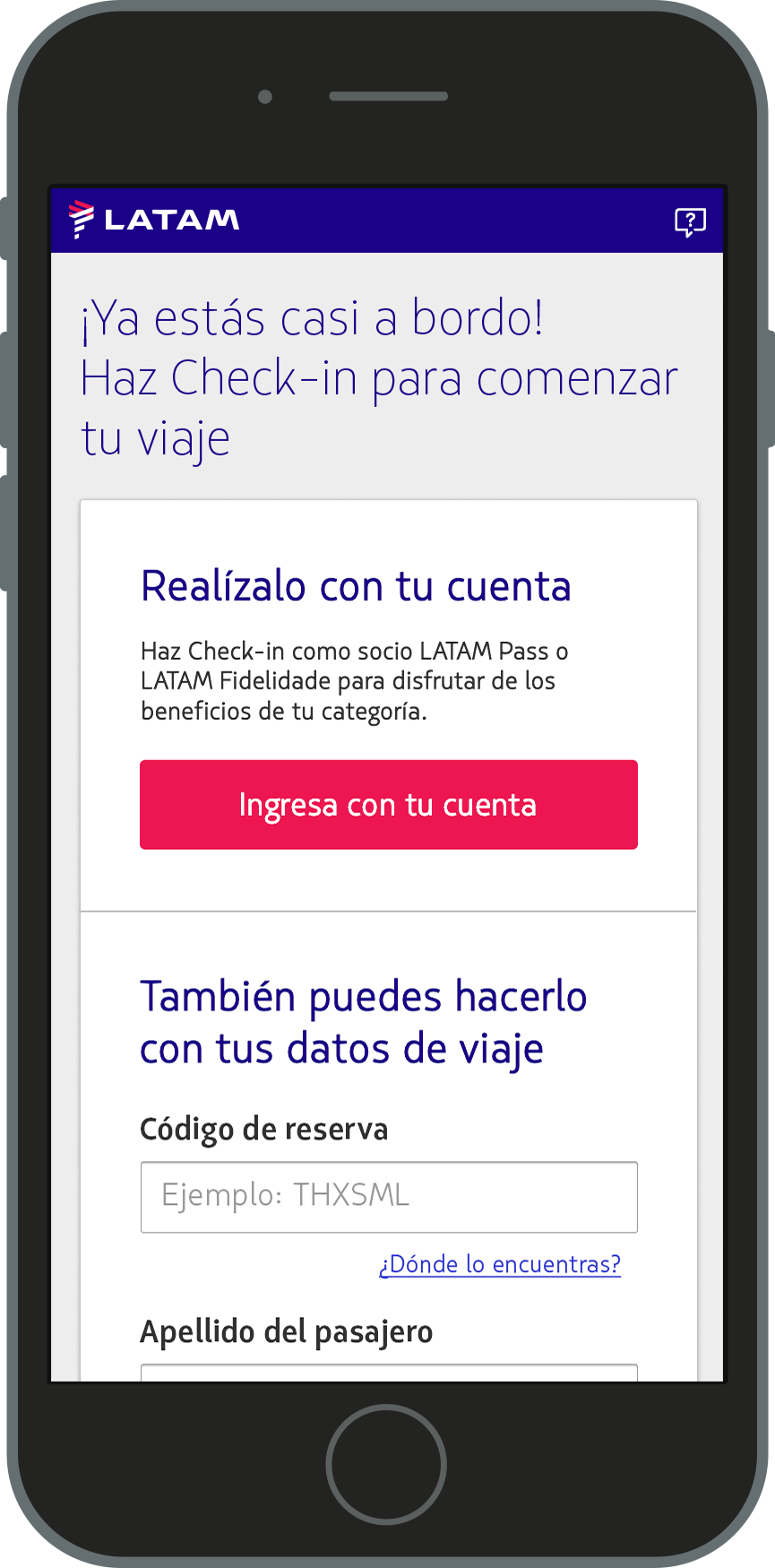
Login
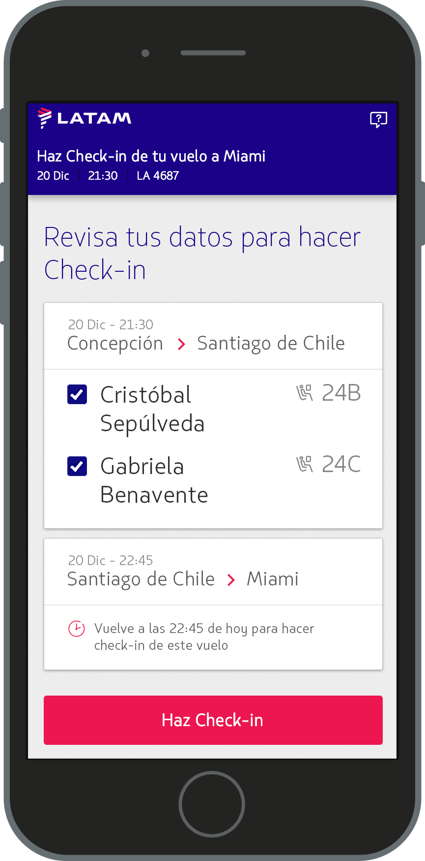
Passengers list
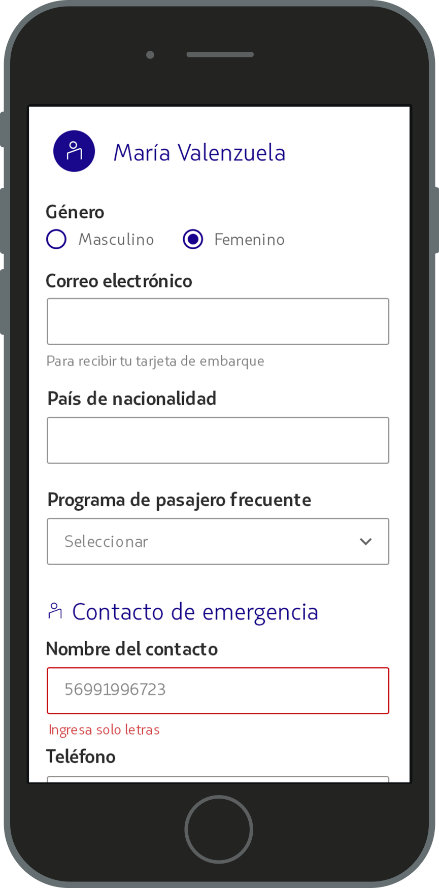
Passenger information
Results
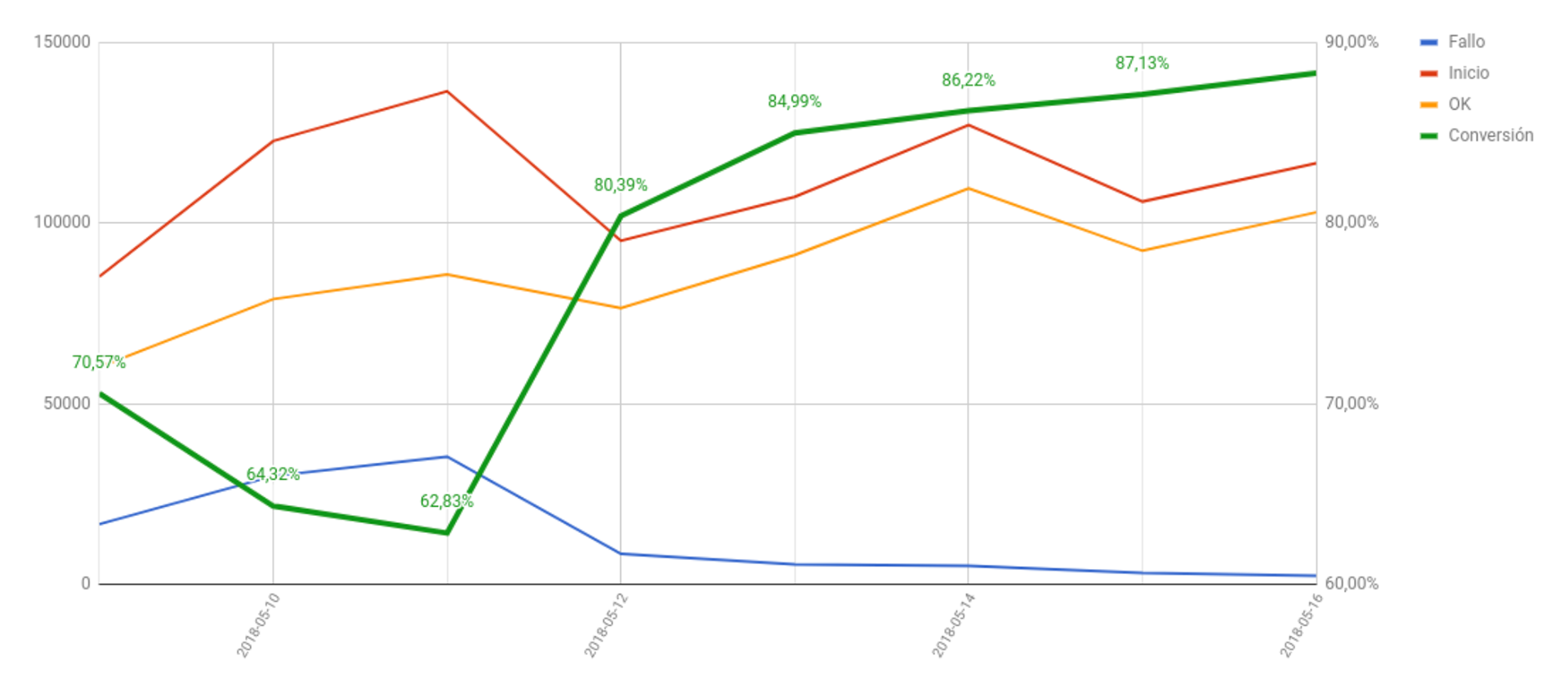
Just with the usability and accessibility enhancements we could observe a 17% more conversion in the check-in user form in just a week